
From Experiments to a Product System
Of course with this, new features frequently exposed limitations in earlier infrastructure and improvements to the backend created opportunities I had not initially planned. Development became a repeated cycle of extension, testing, discovery, and revision across both the product and its supporting systems.
How the Capabilities Compounded
Each of these experiments left behind reusable and scalable infrastructure that reduced the uncertainty of building more features and connecting them on top. Once an underlying capability had proven workable, I could adapt it to support adjacent features without creating an entirely separate system for each one.
As for testing, I worked with a group of beta testers from both the news-fatigued and power-user segments to get qualitative feedback on areas where the experience felt confusing, incomplete, or inconsistent with their expectations. In addition, I continued to expand methods for technical evaluation to further optimize features based on this qualitative user feedback.
Extending Stories into Big Pictures
The move from Stories to Big Pictures was the first major example of this compounding effect. The original clustering experiment had focused narrowly on whether articles covering the same event could be identified and grouped into a reliable Story. Once that foundation worked, I could adapt the same general approach to evaluate relationships among completed Stories.
Rather than treating individual articles as the inputs, the extended system treated each Story as a unit containing its own title, summary, topics, publisher coverage, and semantic representation. Related events could then be connected into a Big Picture representing a larger narrative developing over time.
This produced the core navigational hierarchy of the product:
Each level answered a different question. An Article showed what one publisher reported. A Story showed how multiple publishers covered the same event. A Big Picture showed how that event connected to a larger sequence of developments.
The Story infrastructure also made narrative timelines possible. Because the system could identify when each event occurred and how it related to the larger narrative, readers could follow how a subject developed rather than repeatedly encountering disconnected updates without context.
Big Pictures were not developed simultaneously with the original article-clustering experiment. They were an extension made possible after the foundational Story unit had proven reliable enough to build upon. What began as a technical clustering capability had become the organizing model for the reading experience.
As development continued, story clustering quality became an ongoing human-in-the-loop process of regularly examining the clusters, relying on beta testers to flag groupings that felt incomplete or incorrectly connected, and returning to the backend to refine the weights, thresholds, and rules governing how relationships were formed.
Turning Publisher Data into Reader-Facing Accountability
Publisher enrichment followed a similar path from backend requirement to reader-facing capability. I had originally incorporated attributed MBFC publisher information because the Story experiment needed a consistent way to classify sources and produce coverage distributions. Once that information had been gathered and normalized, the same data could support considerably more: source-credibility scoring within the Feed Formula, identification of coverage imbalances surrounding a Story, and additional context about the publications readers encountered.
This led to Publisher Report Cards. Instead of treating a political-lean label or factuality rating as an isolated badge, each Report Card assembled the available enrichment information into a dedicated publisher profile covering political orientation, factual-reporting history, credibility assessments, ownership and funding, and history. I ended up expanding the 3rd party data sources add even more fidelity and for every assessment to cite its original source and methodology. The intention was never for the platform to declare which publishers readers should trust but rather make the available evidence easier to inspect so readers could reach their own conclusions. A backend requirement discovered during one experiment had become a feature supporting transparency throughout the product.
Evolving the Feed Formula
The transparent ranking architecture created the largest family of extensions, and grew the most as a result. Once the system could accept explicit signal weights, calculate a feed from them, and explain the resulting scores, new forms of control no longer required separate recommendation systems. For example, feed formula presets provided an approachable starting point for readers who did not want to configure every signal individually. “Moods” extended the same infrastructure around providing temporary filters for a user’s feed such as: filtering by highest trending articles for a reader trying to catch up quickly, or showing only semantically positive tagged articles to take a break from emotionally heavy coverage. The formula defined the reader's lasting priorities and a Mood changed what they needed from the feed at a particular moment.
Of course every new extension required more retooling and work in the backend to support it. For example, the “Feel-good” Mood required a completely new sentiment classification system within the aggregation pipeline. The nice thing about this is that once a new capability was added, it could provide another tool to support newer feature capabilities as well.
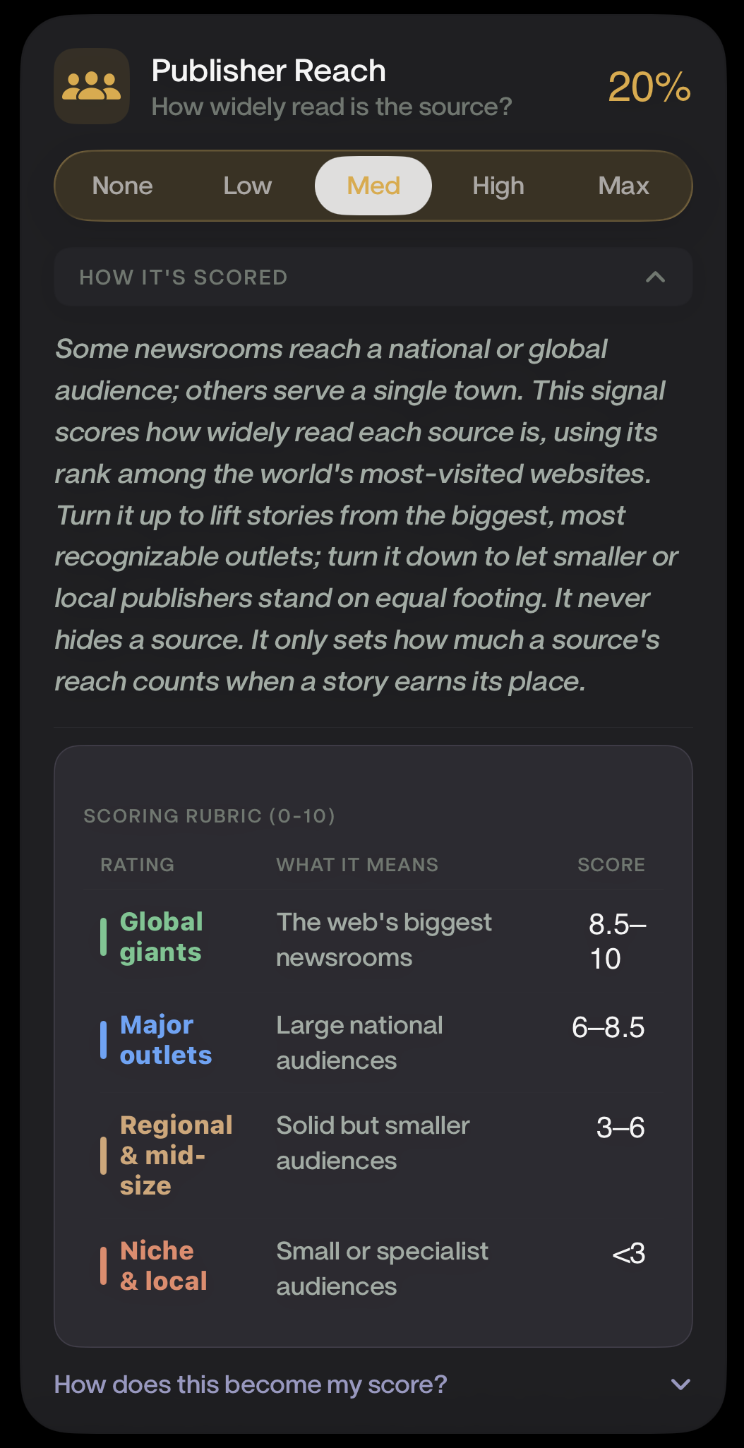
Of course as the platform grew, this underlying feed formula capability had to grow too. The problem became particularly visible when coverage grew from approximately 30 publishers, to 100, to 400. Beta testers began reporting that their feeds were increasingly dominated by publications they had never encountered before. For example, a Story about a global even like the Iran War might be represented in the feed by a local publication such as The Eagle-Tribune instead of from a more mainstream outlet like the Associated Press. The local publication was not necessarily less credible, but its unfamiliarity affected how readers perceived the authority and relevance of the result. This led to the addition of Publisher Reach as a fifth base ranking signal which gave readers the ability to decide how much publisher familiarity and audience scale should influence their feed. Tuning this up or down preserved the ability to discover smaller publications while responding to readers who wanted more familiar sources represented in prominent positions.
The architecture itself also settled into an explainable shape: five base signals evaluating characteristics of the news itself, with reader preferences operating as explicit bonus modifiers applied according to choices stored on the device.
“How does this item rank within the current news environment? + How closely does it match the reader's stated preferences?”
The interface for controlling these signals required its own iteration. One early design presented the formula as a budget of 100 points that readers distributed among the signals with sliders. Mathematically, the model was direct, but the interaction introduced an unexpected feeling of scarcity. Increasing one priority required taking points away from another, and testers questioned why they could not simply set everything to the maximum. The interface was exposing the internal constraint of the scoring system instead of asking readers to express their intentions in familiar language.
After exploring alternatives through UX mockups, I replaced direct point allocation with five semantic importance levels:
None · Low · Medium · High · Max
Readers could describe how much they cared about each signal without manually managing the mathematics beneath it, while the application translated those selections into normalized formula weights and ensured that their contributions reconciled with the final relevance score. This tested well across both customer segments. News-fatigued readers could express a preference without understanding weighted scoring, and power users retained enough fidelity to configure each signal independently. The formula reached a stable state only when technical and human evaluation agreed: when the mathematics behaved as intended, and the changes readers made produced effects they could actually notice. It was the distinction between nominal and effective control from the third experiment, now operating as a permanent product responsibility.
Insights: Closing the Loop Privately
Insights emerged differently from the other extensions. It did not primarily expand one validated capability. It combined the information produced by several of them and returned it to the reader. By this point, the platform could gather and classify articles, identify their publishers, organize them into Stories, and calculate how relevant they were according to a reader's explicit preferences. The system had developed a detailed understanding of the news, but it did not yet provide readers with a corresponding understanding of how they personally navigated it.
The goal was not another mechanism for predicting what would keep someone engaged. It was to allow readers to see patterns they might not otherwise recognize: which publishers they opened most frequently, which topics held their attention, and how their reading was distributed across different forms of coverage. Although much of the necessary information about the news already existed, the behavioral component did not. Building Insights required introducing a new local activity layer. When a reader opened an article, the app recorded relevant information on the device, including the publisher, topic, article type, and reading duration, and analyzed it locally without the backend retaining any persistent behavioral history. The backend supplied structured information about the news. The device maintained the private record of what the reader did with it.
The feature was designed as a private media mirror rather than a judgment or diagnosis. It did not attempt to label someone, tell them their habits were good or bad, or automatically change the feed on their behalf. It presented neutral observations and allowed the reader to decide whether those patterns reflected their intentions. If they wanted to make a change, the existing Feed Formula and preference controls provided the agency to do so. This completed a feedback loop across the product:
Behavioral information normally used by a platform to understand and influence the reader was instead returned to the person who created it. The platform understood the news, while the device understood the reader.
Testing then clarified where Insights belonged in the product's priorities. Readers appreciated it and recognized that its local, privacy-preserving approach strengthened the trustworthiness of the overall platform, but it was not the strongest adoption hook or the most critical everyday surface. The Story hierarchy, Feed Formula, and direct feed controls produced more immediate and recurring value. I therefore treated Insights as an important trust and reflection feature rather than the center of the product experience, and focused subsequent development more heavily on Story quality, feed relevance, and direct control. The distinction shaped my prioritization more broadly: a feature could strengthen the product's identity and the reader's trust without needing to become its most frequently used surface. Testing helped me distinguish between the features that attracted readers, the features they depended upon during regular use, and the features that made the entire system feel more complete and principled.
Insights Reveals the Need for Canonical Topics
The first attempts to make Insights useful also exposed a significant limitation in the article-classification pipeline. Until this point, articles had primarily been assigned broad categories such as Politics, Technology, Business, World, or Entertainment. Those categories were sufficient for organizing general feed sections, but telling a reader that they frequently consumed "Politics" or "Technology" reporting revealed little about what had actually held their attention. A useful Insights experience needed to identify more specific subjects, such as a particular election, policy debate, conflict, company, or public figure. This was not simply an interface problem that could be resolved with different copy. The underlying system lacked a sufficiently precise and consistent language for describing what each article was about.
I therefore began developing a canonical-topic system, using a curated seed list of understandable topic anchors and text embeddings to connect incoming articles to the specific subjects they covered. It became one of the most technically complex capabilities developed during the project, and its difficulty echoed what Story clustering had already taught me: semantic similarity could identify promising relationships, but the closest available match was not necessarily the correct one. A limited anchor vocabulary created gaps, while expanding it introduced overlapping, duplicated, or incorrect classifications. Improving the system required more than changing one similarity threshold. It required continued human review, clearer governance over the topic vocabulary, and stronger validation that an article was genuinely about the proposed subject.
What began as an Insights requirement ultimately improved the larger product. Canonical topics gave the Feed Formula more precise information for matching reader interests, made topic pages more useful, clarified what individual Stories were about, and created a shared vocabulary that could operate across the backend and mobile experience. The path from Insights to canonical topics demonstrated the recursive nature of this phase particularly clearly. The earlier experiments made Insights possible. Building Insights exposed a weakness in the existing classification system. Solving that weakness then strengthened the infrastructure supporting several earlier features.
Progressive Disclosure as a Product-Wide Philosophy
The Feed Formula’s evolution reflected a broader design philosophy that shaped nearly every feature in the product: simplicity and depth did not need to be mutually exclusive, but they needed to appear at different layers of the experience.
The two customer segments did not require separate products. They required different entry points into the same system. News-fatigued readers needed useful defaults, calm presentation, and controls connected to an immediate need. Power users wanted to inspect the underlying methodology, adjust individual parameters, compare sources, and navigate the complete information hierarchy.
I rejected the assumption that serving the news-fatigued reader required removing the transparency and control valued by power users. I also did not want the depth demanded by power users to make the application feel like a professional analytics dashboard. Instead, I applied progressive disclosure so that the initial experience remained approachable while deeper evidence and controls were available when requested.
A reader could open the app and receive a useful feed without configuring anything beyond a few initial preferences. If they wanted to understand why a particular item appeared, the relevance badge provided a doorway into the score. If they wanted to change the system permanently, they could modify the complete Feed Formula. If they wanted a temporary change without understanding the formula, they could select a Mood.
The same principle governed the Story hierarchy. A reader could open one article without confronting every surrounding source, framing summary, publisher assessment, and narrative connection at once. Each additional layer became available as they chose to step back and inspect more of the picture.
Progressive disclosure allowed the product to preserve the depth required by its mission without making that depth a prerequisite for receiving value. It became the bridge between the two customer segments and the threading line connecting the product’s interface decisions.
Chapter Summary
By this point, the product was no longer a collection of independent experiments or features and its capabilities had begun to reinforce one another.
The aggregation pipeline supplied the articles. Publisher enrichment and canonical topics helped the system understand them. Clustering organized them into Stories and Big Pictures. The Feed Formula determined how they reached the reader. Coverage tools and Publisher Report Cards made the information surrounding them inspectable. Moods and feed controls allowed readers to reshape the experience, while Insights privately reflected the resulting behavior back to them. The capabilities had begun to reinforce one another, and the iteration loops had moved the product considerably closer to the experience described by the original requirements.
But a collection of functional and tested features was not yet a product I was prepared to release publicly. The remaining work involved improving data quality, resolving edge cases, strengthening performance, unifying the visual and interaction language, and ensuring that the system could operate reliably beyond the controlled environment of beta testing. Turning the working system into a shippable product would become its own substantial phase.